Data visualisation
Analytics dashboards
A reporting workspace that brings scattered numbers together — so the team can see what is working without exporting another spreadsheet.
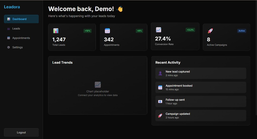
A reporting workspace that brings scattered numbers together — so the team can see what is working without exporting another spreadsheet.
Operator dashboards and reporting
Teams making decisions from too many exports
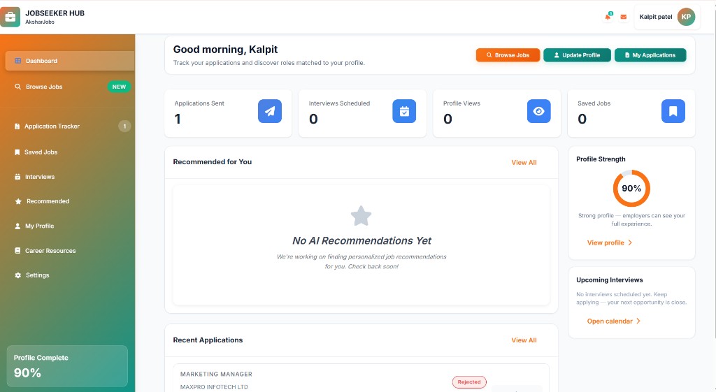
Leadora and Akshar Jobs dashboards
Dashboards fail when they show every metric. We design reporting around the few questions operators actually ask — then wire the sources, permissions, and exports around that.
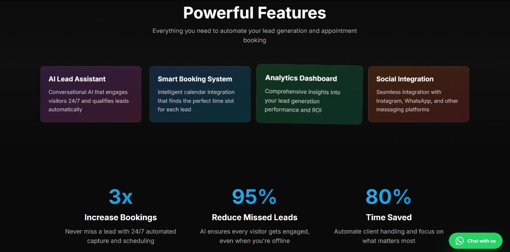
Leadora’s operator view and Akshar Jobs’ hubs are examples of product dashboards that serve a job, not a vanity chart.
The data exists. Nobody trusts the number they see, because it lives in four tools.
We pick the decisions first, then the charts — with role-aware access so finance, ops, and leadership are not sharing one overloaded screen.
We’ll design a dashboard around the decisions you make every week — not a wall of charts.